
Misconceptions about web design keep small businesses invisible online, no matter how much money gets spent on a beautiful site. You expect a new website to bring instant customers. Yet a stunning homepage full of effects rarely earns trust, ranks well, or works properly on the phone in your hand.
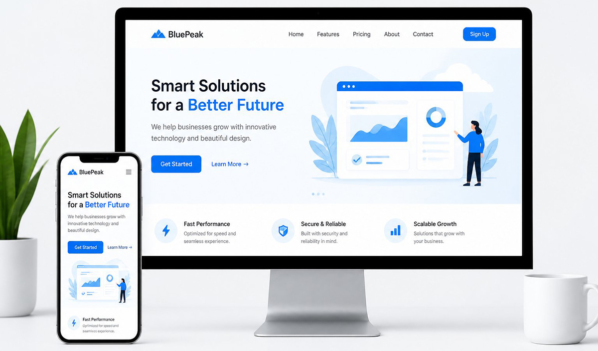
Common Misconceptions About Web Design That Cost You Customers
You picture a new website and instantly think about business growth. Many owners assume that once the site goes live, customers will simply find it. That assumption sits at the center of most misconceptions about web design, and it sets you up for disappointment fast.
A website does not sell for you. It does not knock on doors or hand out flyers. Instead, it waits online, ready to share information the moment someone looks for it. Understanding how a website works changes the way you plan, build, and use one from the very beginning.
This mismatch between expectation and reality shows up everywhere. You hire a designer, you approve a beautiful layout, and then you wait for the phone to ring. When it does not ring right away, frustration sets in fast. The blame usually lands on the wrong part of the process.
Most business owners never hear an honest explanation of what a website can and cannot do. That gap in knowledge is where so many misconceptions about web design get started in the first place.
The cost of these misconceptions about web design adds up quickly. A designer builds what you request, not necessarily what your business needs to succeed. If nobody explains the difference between a beautiful site and a functional one, you end up paying twice. You pay once for the build and again for the marketing work that should have shaped it from day one.
A Website Works Like a 24/7 Information Center, Not a Salesperson
Think of your site as a 24/7 information center rather than a salesperson. It holds details about your business at every hour, whether anyone visits at noon or at midnight. A business card does something similar, but your website can say far more than a card ever could.
A card gives your name and phone number. Your website can explain your services, show examples of your work, and answer questions before a visitor ever calls. That expanded reach is the real value of a website, and it has nothing to do with flashy design.
Once you understand that role, the next decision involves deciding what content actually belongs on the site. Information beats decoration every single time a visitor is looking for real answers.
Why Flashy Effects Are One of the Biggest Misconceptions About Web Design
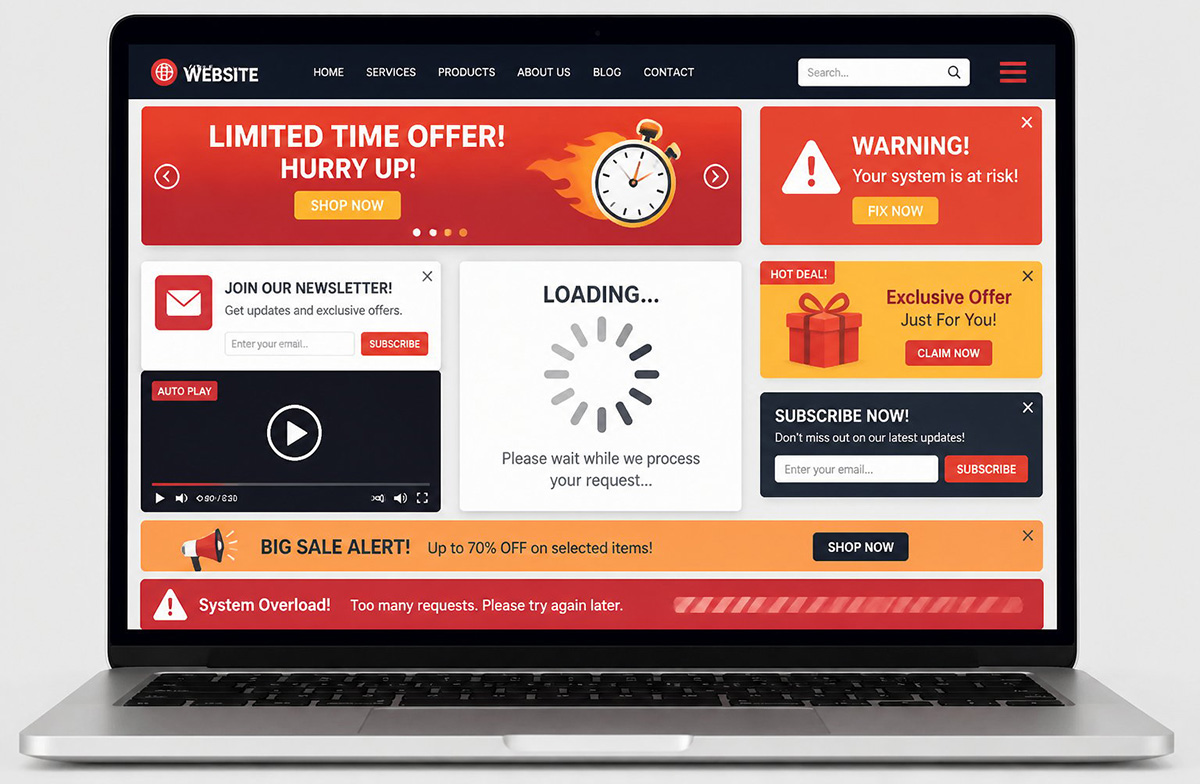
You have probably seen websites packed with sliders, spinning graphics, and video backgrounds that play the moment a page loads. Those features look impressive during a demo, and many owners request them for that exact reason. Unfortunately, this is one of the most damaging misconceptions about web design floating around today.
Every animation, video, and slider adds extra code your site has to load. That extra weight slows the page down. Slow pages frustrate visitors before they even see your content. Most people leave within a few seconds rather than wait for anything to finish loading.
Search engines notice that behavior too. A site that loads slowly tends to rank lower, even if the design looks polished. Speed and clarity beat visual flash almost every time, and no amount of animation changes that basic reality.
What Happens When Effects Meet a Small Screen
Nearly everyone browsing today pulls out a phone rather than sitting down at a desktop computer. That single fact changes everything about how a website should get built. Plenty of designers still treat mobile screens as an afterthought during the design process, and that habit creates real problems.
Effects that look smooth on a large monitor often break completely on a small screen. Sliders stack awkwardly, background videos eat through mobile data, and heavy animation drains battery life. What felt cutting edge on a laptop can feel broken and frustrating on a phone.
Buttons built for a mouse click often sit too close together for a thumb to tap accurately. Text sized for a desktop screen can shrink down to nearly unreadable on a phone. These small mobile problems add up fast, and visitors rarely stick around long enough to fight through them.
Search engines also judge your mobile version first, not your desktop version. If your phone experience loads slowly or looks cluttered, your rankings suffer. That happens no matter how nice your site looks on a bigger screen. Skipping the extra effects protects both your visitors and your visibility online.
Most web traffic today comes from a phone rather than a desktop or laptop computer. Building a site around desktop effects while treating mobile as an afterthought is one of the more expensive misconceptions about web design a business owner can make. Testing every page on an actual phone before launch catches most of these problems early.
A clean site that loads fast on a phone will almost always outperform a flashy one that only works well on a desktop. Simplicity keeps every visitor moving toward the information they actually came to find. This single mobile issue drives more of these misconceptions about web design than almost any other factor.
A Real Website Example Behind These Misconceptions About Web Design

One of my customers, writes and sells books. She paid a designer $2,700 to build her a site. It includes a polished feature where visitors click through a short story and solve a small mystery. It looks genuinely impressive on a screen, and she was proud to show it off.
When I checked what her site actually ranks for, I found nothing at all. The domain uses only her name, with no mention of her genre or the kind of books she writes. No keyword language anywhere tells a search engine, or a new reader, what she actually sells.
The interactive mystery is fun, but it brings in zero readers and zero sales. She spent real money on entertainment while skipping the basic groundwork that would have supported her actual goal. That gap is one of the clearest misconceptions about web design you will ever see in action, because a fancy feature replaced the planning that mattered more.
Her story is not really about search rankings, even though a lack of visibility plays a part in it. It is about walking into a project without a clear list of goals or the basic content that goal required. Nobody sat down with her first and asked what she actually needed the site to do.
This one project captures nearly every one of the misconceptions about web design covered in this guide. A few small changes would have made a real difference for her. A domain name mentioning her genre would have helped. So would a page describing her books by category and a short author bio built around the search terms her readers actually use. None of that requires flashy design work, just planning done before the build starts.
Visibility problems like hers happen more often than most owners realize. This guide on why your website may not be showing up on Google breaks the process down further.
Know Your Goal Before You Hire a Web Designer

Before you hire anyone, decide exactly what you want your site to accomplish. You might be trying to bring in local customers who search for your service, or you might want to sell a product directly through the site. Some businesses only need a page that gives more detail to people who already have their number.
Each of those goals needs a different structure. A simple contact page does not need the same setup as a store built to process online orders. Clarity here saves you money and prevents wasted effort later on down the road.
Build Your Pre-Hire Checklist
Sit down and make a list before your first call with a designer. Write out the pages you actually need. Note what a visitor should learn within the first few seconds on your homepage. Include the specific words a customer would type into a search bar to find someone like you.
A short list like this takes less than an hour to put together. That single hour can save you thousands of dollars spent on features that never support your actual goal. It is exactly the step that got skipped with my sister.
This planning step is where most misconceptions about web design quietly disappear. Once you know your goal, every decision gets easier. Page count, content, structure, and even the domain name all start pointing in the same direction instead of pulling against each other.
A designer can build a page that looks great, but only you understand your customers and your product. Only you know the message that needs to reach them. Handing over that responsibility to someone who has never run your business rarely produces the results you actually want.
Ask any designer how your site will perform on a phone before you approve a single design element. Ask how each feature affects loading speed. Those two questions alone will steer you away from most of the common misconceptions about web design that trap other business owners.
Avoiding the Most Common Misconceptions About Web Design
Most misconceptions about web design come down to one simple mix up. People confuse a beautiful site with an effective one, and those two things are not the same. A site can look stunning and still fail to load properly on a phone. It can still rank nowhere and convince nobody to reach out.
Skip the sliders, the autoplay video, and the heavy animation. Build around speed, clarity, and mobile performance instead. That is where your actual customers are searching from every single day. A simple site built with a clear goal will outperform a flashy one nearly every time it gets tested.
Avoiding these misconceptions about web design starts with one honest conversation before any building begins. Do you want your website to actually work for you and start bringing in real business and traffic? Visit our affordable local SEO services page to see how we can help you get there.